Monday, October 28, 2019

Spectral Analysis Clairemorris, Ireland Wind Speeds

Clairemorris, Ireland Wind Speed data (1970.7 - 1973.7)

As part of the Future Learn Environmental Modeling class we are given some data from Clairemorris Ireland. Clairemorris is located in the west of Ireland about 30 miles north of Galway. The wind speed data (Figure 1) reveals some long period (roughly annual) oscillations in speed along with seasonal changes in the wind speed variation.


Figure 1: Wind speed measurements from 1970.7 to 1973.7. Speed is in knots.

The amplitude spectrum of wind speed is characterized by a general decay of amplitudes with frequency(Figure 2). Low frequency (long period) amplitudes are greater than the higher frequency (short period) variations.


Figure 2: Amplitude spectrum of wind speed observations at Clairemorris. 
A frequency of 0.1 corresponds to a period of 10 days and 0.5 to 2 days.

A closeup view of the spectrum from 0 to 0.1 cycles/day (Figure 3) reveals that the highest amplitude components of the wind speed variation occur with annual and semiannual period. There are some additional relatively high amplitude peaks in the data around 26 and 14 day periods. A low pass filter is designed to extract the annual, semi annual variations and longer period variations in the data. A cutoff frequency of 0.01 cycles/day (100 day periods) is used. 


Figure 3: Closeup view of wind speed spectrum out to 0.1cycles/day.

The low pass filtered output provides a more seasonal view of the average fluctuations through the period of observation. The scatter in observations about the long period response highlights changes in the standard deviation through time. The plot reveals peak winds in the fall-early winter of 1970 and 1973. There is also a period of high winds mid year 1972. The period of observations is not long enough to reveal consistent annual wind patterns.


Figure 4: The low pass filtered output (red) shows the longer period oscillations 
extracted by low pass filtering.

The  

 Figure 5: Change points identified in the wind speed differences (bottom) are
projected onto the input data (top)

 Figure 6: The derivative or difference is easily calculate in the frequency domain 
through multiplication of the spectrum by i x angular frequency.

 Figure 7: Wind speed standard deviations.

Thursday, October 17, 2019

Analysis of Mauna Loa CO2 data


 Basic Data Analysis

CO2 data provided through the Future Learn Course  "Data Science for Environmental Modelling and Renewables",  University of Glasgow lead by Professor Marian Scott. Atmospheric concentrations of CO2 measured on the summit of Mauna Loa on the Big Island of Hawaii show annual oscillations superimposed on a long term rise (Figure 1). The best fit quadratic (Figure 1) provides 0.997 correlation to the long term CO2 trend.

Figure 1: Atmospheric CO2 Concentrations 1952-2018 - Mauna Loa, Hawaii.

Some shorter period annual oscillations about the best fit line can be observed (Figure 1). A plot of the residual (Figure 2) emphasizes these variations. The annual variations about the best fit quadratic are on the order of 6 ppm.

Figure 2: Residual atmospheric CO2 concentrations. The annual cycles are pronounced.

I take a spectral filtering approach to remove the annual cyclical rise and fall of CO2 from the data. The spectrum of the residual reveals some pronounced peaks associated with the annual variation and its harmonics (Figure 3). Ideally we would like to eliminate the annual cycles and harmonics. This is easily done using a low pass filter. The region of interest is shown in the lower frequency end of the spectrum (Figure 3).

Figure 3: Amplitude spectrum of residual Mauna Loa CO2 concentrations.

I applied a low pass filter with a 0.06 cycle/month (cpm) cutoff frequency to eliminate the annual variations. The low pass filtered output (Figure 4) matches the unfiltered spectra at low frequency and is 0 for frequencies greater than 0.06cpm.

 
 Figure 4: Low pass filtered output spectrum (red) shown 
along with the unfiltered residual spectrum.

A close up view of the spectrum from 0 to 0.1 cpm highlights the effect of filtering (Figure 5). The large annual peak (black) present in the unfiltered residual has been removed in the filtered output (red). The filtered residual contains some long period (low frequency) peaks that are further enhanced when plotted separately (Figure 6).

 Figure 5: Filtered (red) and unfiltered (black) CO2 residual spectra.

In the closeup view the low frequency response in the residual is enhanced (Figure 6). We see peaks at approximately 30 and 15 year cycles.

Figure 6:  Low pass filtered residual CO2 concentration spectrum. 
Period in years of some peaks are labeled.

Peaks that might be associated with solar intensity (sunspot cycle) variation are noted around 9 cpm.  An additional peak with a period of about about 4 years is also present in the data. The largest amplitude oscillations in the residual have a period of about 30 years. One wonders how local volcanic emissions from the East Rift zone may have contributed to some of these local variations.

The filtered and unfiltered output are shown for reference (Figure 7). Low pass filtered output suggests reveals the form of the subtle long and short period variations superimposed on the overall quadratic rise in CO2 concentration since 1959.

 Figure 7: Low pass filtered and unfiltered residual CO2 concentrations.

Is there a relationship between solar energy output to some of the fluctuations we see in the residual? Does increased solar radiation enhance plant growth O2 production and CO2 depletion? The comparison of long period residual CO2 oscillations with solar intensity variations (Figure 8) indicates there is little case to be made for any influence of 11 year sunspot/solar intensity variations on  CO2 fluctuations. However, a relationship could lie in the amplitude of the annual CO2 cycles.

Figure 8: Comparison of low pass filtered residual CO2 concentrations 
with solar intensity variations.

Comments

  • The 59 year record of CO2 variations on the summit of Mauna Loa, Hawaii increase from about 316 ppm to 407 (mid 2017).
  • The rising CO2 concentrations are accurately modeled using a quadratic relationship with correlation coefficient of 0.997. This is only slightly better than an exponential fit that yields a correlation of 0.992.
Spectral analysis and filtering have been used to evaluate the Mauna Loa CO2 data.
  • The amplitude spectrum shows a pronounced peak for the annual frequency. Tree harmonics are also present.
  • The filtered spectrum reveals a complex frequency response in the CO2 variations over the 59 year record of observation.
  • We observe prominent cycles with periods of approximately 30, 15 9 and 4 years.
  • These variations are subtle and of the order of +- 1ppm.
  • The CO2 rise observed on Mauna Loa without annual variations is shown in the low pass filtered output (Figure 9).

Figure 9: Long term variations in atmospheric CO2 concentrations.
Annual cycles removed. 
As discussed in the class module 2.7 Trend and Seasonal Effects the trend in this data is quadratic although some would be on firm ground to argue exponential. The seasonal effect is easily recognized in the data as annual sinusoidal. The unexplained variations (eg. Figure 8) does not appear random. Understanding the significance of these variations would require some additional study, perhaps of local volcanic emissions. The annual effect was not extracted as a separate time series but could have been using a bandpass filter. We could then reconstruct the original data using an additive model approach with CO2 variations = sum of long term quadratic trend + unexplained variation + seasonal.

Wednesday, October 16, 2019

Central England Temperature Data Analysis

 Basic Data

Central England temperature data provided through the Future Learn Course  "Data Science for Environmental Modelling and Renewables",  University of Glasgow lead by Professor Marian Scott. Temperature measurements from central England reveal a gradual rise in temperature from 1659 to 2015 (Figure 1). Temperatures measured in the month of January rise more in the last 100-200 years than do the temperatures observed in the month of July. The parameters for the best fit quadratics are shown in Figure 1.The quadratic appears to do be a good approximation of the general temperature trend over the 357 year observation period. The residuals sum to 0.

                            a)
                           b)

Figure 1: a) Daily average temperatures in January; b) daily average temperatures in July. 
Best fit lines are quadratics.


Smoothed temperatures in July and January are plotted separately for reference (Figure 2). The winter temperatures have a range of about 3 degrees C, while the summer temperatures range is approximately 1.5 degrees C. Both exhibit a rising trend in recent years, but that rise is more pronounced and persistent in the January temperatures. January temperatures have increased persistently since the early 1800s.

Figure 2: Comparison of smoothed July temperatures (red) and January temperatures (blue).

 The three data sets along with best fit quadratics are presented for general comparison (Figure 3)

Figure 3: Smoothed July (pink), average annual (green) and January (blue) temperature comparison

The smoothed residual temperatures for July, annual and January (Figure 4) reveal some interesting interrelationships. The comparison reveals multiyear periods of warmer summer temperatures are sometimes accompanied by cooler winters, with the opposite also being true. This dampens the smoothed average annual response during those years. We also see periods of time when both the summers and winters were warmer along with periods when both were cooler.

Figure 4: Residual smoothed temperatures for January (blue),July (pink) and average annual (green)


The amplitude spectrum of the smoothed residuals reveals the presence of prominent longer period features in the temperature series (Figure 5). Temperature variations with periods less than 10 years appear to be largely random.

Figure 5: Amplitude spectrum of January, average annual and July temperatures from 1659-2015.

The expanded view of periods longer than 10 years provides some evidence for cyclical temperature change superimposed on the 356 period of measurement (Figure 6). 

 Figure 6: Long period peaks in the spectra of smoothed temperatures.

The periods visible in figures 2-4 are most pronounced in the winter temperature variations. Winter temperatures show some cyclicity with approximately 177 and 90-60 year period.   These peaks are less pronounced but also present in the summer and annual temperature variations. Summer and winter variations also appear to contain a 40-24 year component. One wonders if the small peak observed between 0.075 and 0.9 cycles per year might be associated with sunspot cycles and accompanying variations of solar intensity.

Comments

  • We see evidence of increasing temperature in the July, average annual and January trends. This increase is most pronounced in the January temperatures. Winters see nearly twice the warming with winter temperatures increasing by more than a degree (quadratic fit in Figure 1a) with summer temperatures increasing by approximately a half degree.
  • The comparisons reveal periods of time during which hotter summers are accompanied by cooler winters, periods when both summers and winters are hotter or cooler and periods with cooler summers accompanied by warmer winters. 
  • Cyclical temperature variations are most pronounced in winter temperatures. Temperature variations occur with pronounced periods of approximately 177 years and 90-60 years. Smaller amplitude variations are also observed with 40 to 24 year periods. A speculative observation of potential sunspot cycle periodicity in the temperature data is made.


Tuesday, October 15, 2019

Spectra of Mauna Loa Wind Speed Data

Spectra of Mauna Loa Wind Speed Data (2011-2014)

Wind speed data spectra shown below were made using data provided through the Future Learn Course  Data Science for Environmental Modelling and Renewables. The course is provided through the University of Glasgow with a team of instructors lead by Professor Marian Scott. 

Daily average wind speeds (Figure 1) were calculated from hourly data in R using the course program intro_windpower. Note maximum windspeeds occur around annually around the new year with average daily speeds of 15-20 mph. 

Figure 1: Average daily wind speed Mauna Loa, Hawaii calculated over the 2011-2014.


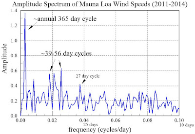
Spectra generated for daily average wind speed data from Mauna Loa reveal the presence of some cyclical wind patterns (Figure 2).More pronounced peaks reveal the presence of annual periodicity in the wind speed patterns along with a series of 39-56 day cycles. There is a band of periodic behavior that stands above the background between 4.5 and 14 day cycles.
Figure 2: Amplitude spectrum of daily mean Mauna Loa wind speed data. 

A closeup view of periodic wind speed behavior out to 10 day periods (Figure 3) shows spectral response down to 10 day cycles. Relative to the peak annual amplitude, these secondary peaks may be more speculative. 39-56 day cycles do stand out. We also see what may be a 27 day cycle in the wind speeds.


Figure 3: Closeup view of longer period wind speed variations observed on Mauna Loa.

Spectral analysis reveals a prominent annual trend with some additional periodic winds occurring at approximately 40 - 60 day intervals (Figure 3). Reference back to the average wind speed data (Figure 1) suggests these 40-60 day patterns emerge early in the year and are also superimposed on the annual peaks.